Weekly update, July 09, 2020
Hey Mages! How was your week? We hope it was good!
What’s up since last week?
Mostly cards balancing and artwork creating. Concerning artworks we though you might be pretty curious about how we get artworks done for Mage Noir. So we’ll give you a glance at our workflow, little by little! Today we’ll tackle everything an artwork has to take in count in Mage Noir.
But first, quick talk about cards balancing
We’re currently reviewing Water spells and modifying them. It’s actually a very delicate balance as the slightest change might make Water very weak or way too strong very quickly. We’re still working on it to make sure it feels both good to play with and against. For now we’re still testing and we try all sorts of effects to find the right strenght and feeling for the Water element.
Making a card artwork.
As a disclaimer, the process will be described not from an artist but from a designer’s point of view. (I, the redactor, like to draw sometimes but I’m very far from having a tenth of the abilities our artists managed to get through their hard work).
We have a ton of objectives when making an artwork for the game.
Examples of what should be taken into account
Does it fit Mage Noir?
This one might seem simple at first and it is most of the time. We don’t have an horror theme, nor do we have an everyday life theme in the game. So a monstruous horror or a simple scene would instantly be recognized as weird in the game right?
But wait, we have magic and a secret society. Wouldn’t a spell be able to create monsters? Wouldn’t a secret society manage to have a grasp on our everyday life? Well yes and yes. This is why it’s up to the team to determine where we draw the line. Most of the time it’s easy to do but sometimes it’s a very valid question.
Is it recognizable?
By that, we mean that a player should be able to recognize a card only by it’s artwork at first glance and without hesitation. This is why artworks should not look too much alike.
Is it part of a set?
This is where it gets tricky, cards should be easy to distinguish, but cards from a set should feel like they are part of a whole. So they should be linked to one another somewhat graphically. This may create very similar artworks, which is what we want to avoid.
Can the element be mistaken?
This peculiar question might not seem like much, but it’s the one we have to take care of the most. Very often we might want to add extra details to our artworks to make it more exciting. For instance on a powerful Air spell, you could see small rocks and dust raising from the power of the winds… It would look cool but wouldn’t we mistake it for a Mineral spell then? We have to answer this question way more than what we anticipated.
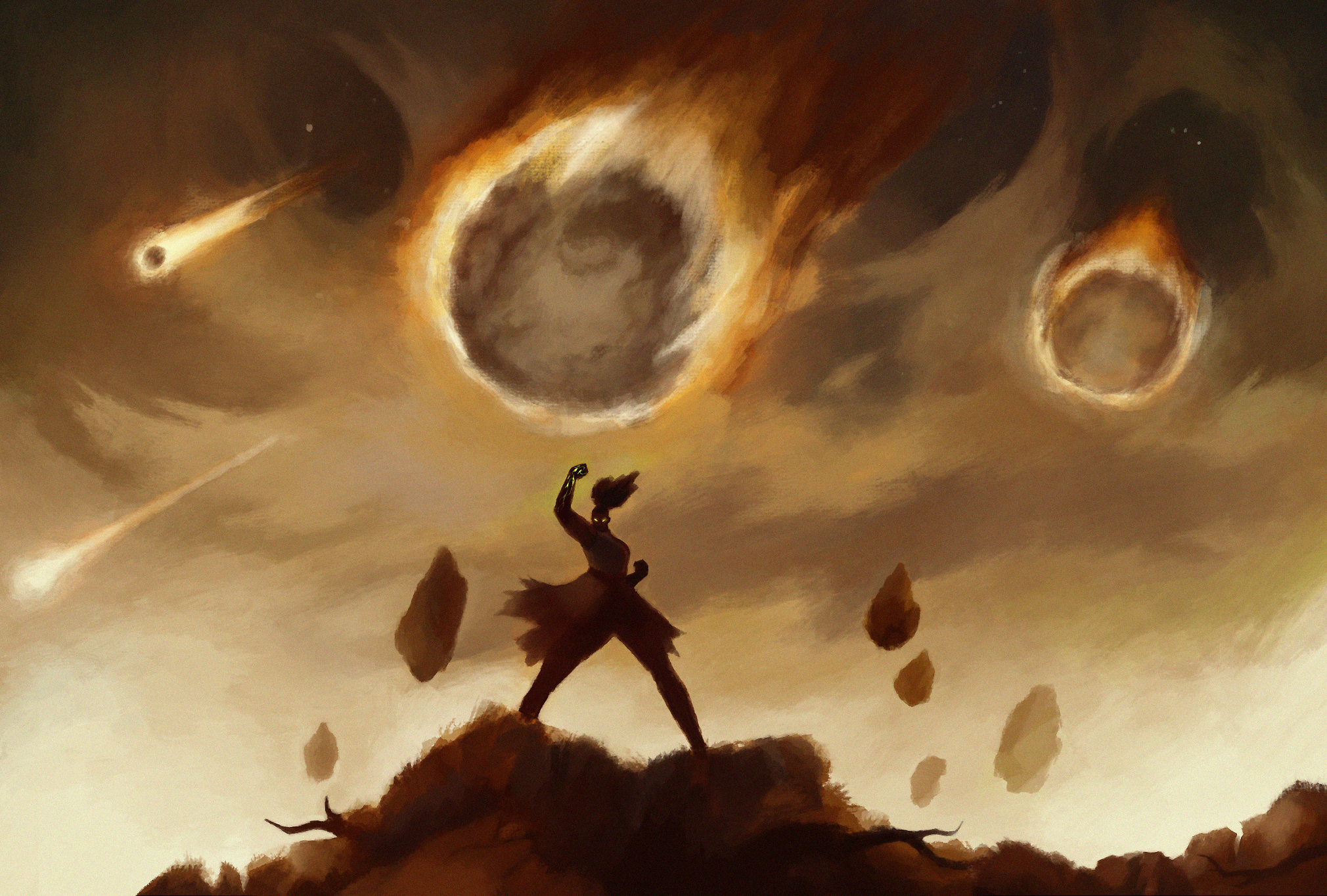
Take Ina’s meteore for instance:

It is a Mineral spell but was initially created with the meteore completely in flame, which is logical given the fact that it passes through the atmosphere. As logical and cool as the idea was, we had to tone down the flames and change the colors to make it as easy to identify as possible (and the result is absolutely epic).
Does it fit the lore?
This one is obvious but it still is something we have to think about a lot. As you may know, the Mage Noir lore has advanced a bit but it is not completely finished yet. The fact that it’s not completed yet gives us some room for new ideas and events, but sometimes an artwork idea will go against the story and will have to be put aside, no matter how awesome it sounded on paper.
And those are just example of the numerous things we have to take care of! It is complex but very interesting!
That’s all for today Mages!
Next week we’ll tackle the workflow concerning how the artworks are made. In the meantime, have fun and stay safe.