Weekly update, November 19, 2020
Hey Mages! It’s weekly update time. This week we got some visuals!
So what’s up since last week?
We’ve shown bits of it over the past weeks, but we can now show you the whole new card layout! We hope you’ll like it.
Let’s not wait any longer.
Here it is!
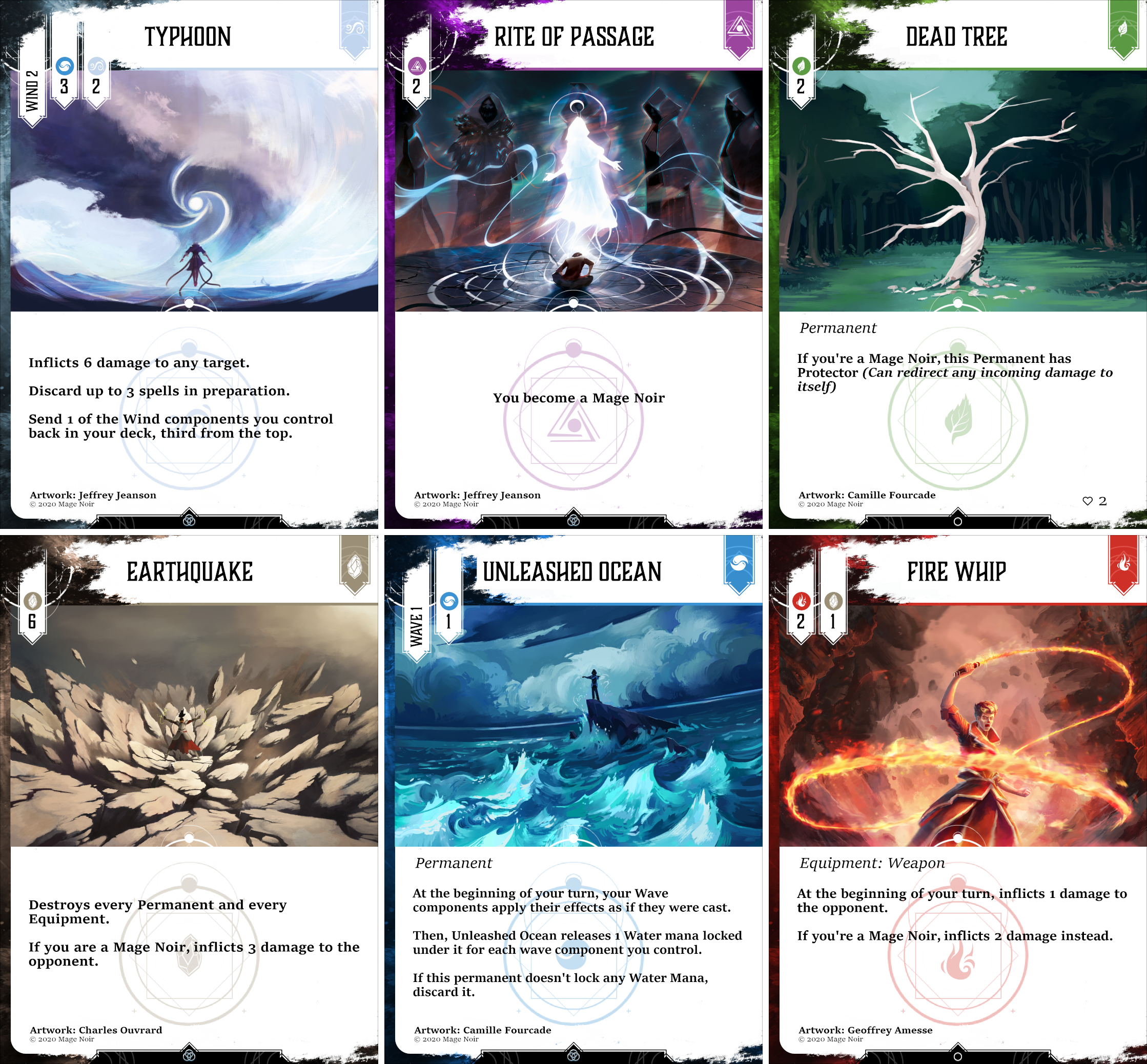
Although we have to tell you first, those cards, their wording and their content might be subject to change as we try to make the game better.
Now concentrating on the new visual, as you can see it’s way clearer and much more modern. We love how it’s easier to read with the black font on white background. It also has a lot of cool perks:
- It’s easy to know what element the card is.
- It’s just as easy to check out what rarity it is.
- Both of those are readable for colorblind people.
- The texts are much larger in general compared to the previous design.
- The various costs are much clearer and simpler to grasp.
- It has a lot of room for the artwork and it’s easier to read who the artist is.
We love how it feels in hand and we’re very proud of it.
We now have a lot of work ahead to update what has to be! So we’re going to keep this weekly update short.
So that’s all for today Mages!
We hope you like it and we’d be delighted to answer any question you have. So feel free to comment about it Mages!
Until next week though, take care of yourselves, and have fun!